


A logo is the one design decision that gets manufactured. By the time you want to change it, it is on the boxes in your warehouse, the sign above the door, and a printing plate somebody has to cut again.
There is a particular silence in a meeting when somebody asks what the new logo will cost to roll out. Not to design. To roll out. Then someone opens a spreadsheet and starts counting cartons.
A logo is cheap to draw and expensive to own. Of everything you design, only the logo gets manufactured. It ends up stamped into metal dies, engraved onto printing cylinders, stitched into uniforms, moulded into product parts and uploaded to app stores that take days to approve a change.
So this covers the practical version: what a logo is actually for, what the famous ones have in common, how to make one, what to test before you sign it off, and why it pays to get it right the first time.
What a logo is actually for
A logo is identification at speed. Someone scrolling a marketplace, scanning a shelf or looking at a parcel on a doorstep decides in well under a second whether that thing is yours. Everything else about the design is secondary to that job.
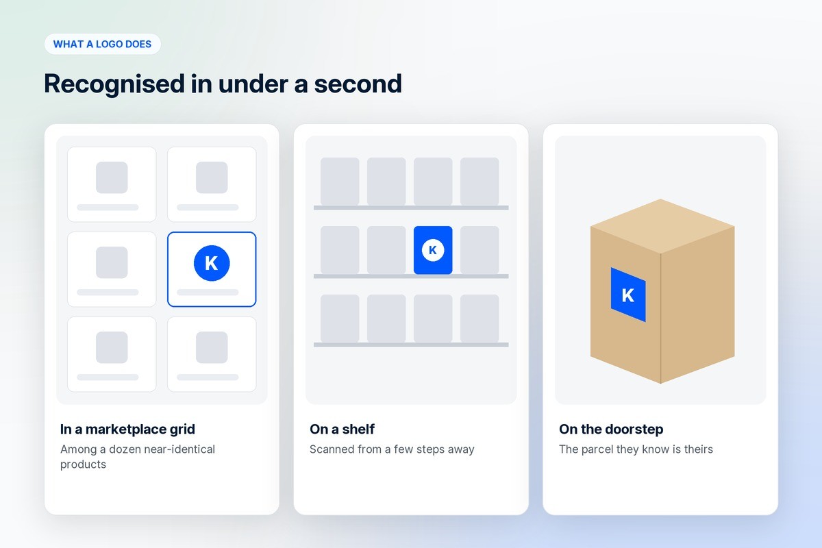
The logo is also the smallest and most repeated piece of your brand. It appears as a favicon, an app icon, a line on an invoice, printing on box tape, a thumbnail on an ad, a sign above a door and a signature at the bottom of an email. Almost nothing else you design shows up in that many places at that many sizes. That makes it the most visible single element of your ecommerce branding, and the one most likely to be reproduced badly by somebody else.
What a logo does is make you findable again. A customer who liked what you sold but cannot recognise you the next time is not a returning customer. What a logo cannot do is create trust on its own. That comes from the delivery date you kept and the refund you processed without an argument.
The x factor: what iconic logos have in common
Almost nothing you would call clever. Most of the marks you can picture right now are dull when described out loud.
You can draw it from memory. Simple shapes survive being remembered badly.
It reads at the size of a favicon and at the size of a shopfront.
It works in one colour. If it needs a gradient to make sense, it will collapse on an embroidered shirt and a thermal shipping label.
It has a distinctive silhouette. Recognition happens on outline first and detail much later, if ever.
It avoids whatever the current decade is doing. Anything that looks precisely of its year will look dated the year after.
It has been repeated, without being fiddled with, for a very long time.
That last point is the uncomfortable one, and it is the real x factor. Most famous logos were not impressive on the day they launched. The Nike swoosh was considered unremarkable at the time, and the student who drew it was paid a token amount for it. What made it iconic was appearing on everything, essentially unchanged, for decades.
Meaning gets deposited into a mark by repetition. Almost nobody designs it in at the start. That is good news for anyone making one now, because it means you do not need a stroke of genius. You need something simple, distinctive and durable enough that you are still willing to use it in ten years.
How to create one
Write down what has to be recognisable: the name, the category you are in, and one quality you want associated with it. Three lines, not a brand deck.
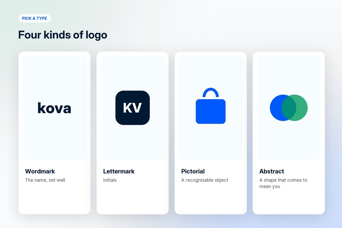
Pick a type. A wordmark is the name set well. A lettermark is initials. A pictorial mark is a recognisable object. An abstract mark is a shape that means nothing yet. Most small businesses are best served by a wordmark plus a simple mark that can stand alone as an app icon.
Set the name in a good typeface before you draw anything. A large number of strong logos are a name, set carefully, and nothing else.
Sketch in black and white. Colour flatters weak shapes and hides the problem until it is expensive.
Remove detail until the mark stops working, then put back only the last thing you removed.
Test it small and large before you get attached. Sixteen pixels wide, and then a metre wide.
Choose colour last, and choose one that survives brown kraft board, a dark screen and a cheap print run.
Deliver vectors, meaning SVG plus AI or EPS, along with a one-colour version, a reversed version, a minimum size and a clear-space rule. A PNG is not a logo. It is a picture of one.
What to check before you sign it off
Run the mark through the places it will actually live. Most logo problems are discovered by a supplier, months later, at the worst possible moment.
A 16 pixel favicon, and an app icon at its smallest size on a phone.
One colour, black on white and white on black, with no grey in between.
Sitting over a photograph, and over the busiest part of your packaging.
Embroidered. Thin lines and small gaps simply disappear at stitch resolution.
Embossed or engraved, where fine detail fills in and vanishes.
Printed on brown kraft board, which eats pale colours.
On a thermal shipping label, which is low resolution and unforgiving.
Rotated onto a vertical sign or the side of a vehicle.
Drawn from memory by someone who looked at it for five seconds.
Why you cannot change it every day
Design cost is visible and rollout cost is not, which is why this gets underestimated. A logo is the point where a brand stops being a file and becomes a physical object, and physical objects are made in batches by machines that were set up for the old artwork.

Packaging already printed. Cartons, labels, mailers, tape and inserts are bought in runs, usually months ahead. Changing the mark orphans what is in your warehouse and whatever the printer has already produced.
Printing plates and cylinders. Flexographic and gravure printing use engraved plates or cylinders, one per colour. New artwork means new plates, and each additional colour is its own plate and its own bill.
Spot colours. If your brand colour is a specific mixed ink rather than a process build, changing it means new ink and a new setup, not simply a new file.
Metal dies. Foil stamping, embossing and hot stamping all use physical dies that have to be cut again from scratch.
Embroidery files. Every stitched logo is a digitised file, tuned per fabric and per size. A change means re-digitising and sampling again.
Tooling and moulds. If the mark appears on a moulded or machined part, this is the expensive end of the list.
Everything already out in the market. Stock sitting on shelves, parcels in transit, product photographs on marketplaces, printed catalogues, signage, vehicle graphics and uniforms.
Then there is the digital tail, which is cheaper but slower than people expect: app icons and store listings that need review, ad creative already approved, email templates, invoice and tax document headers, marketplace storefronts, and whatever your resellers and partners printed on your behalf.
The cost that never makes it into the spreadsheet is trust. During any transition your customers see two versions of you at once, and a parcel that does not match the shop they bought from is precisely the signal that makes a first-time buyer hesitate before opening it.
None of this is an argument against ever rebranding. The argument is for deciding once, carefully, and treating the mark as a ten-year commitment rather than something to revisit each quarter.
Common mistakes
Designing at a large size on a big screen and never zooming out to check it small.
Letting colour or a gradient carry the whole idea, so the shape underneath is weak.
Copying the current style closely enough that the logo dates itself to a specific year.
Hiding meaning in details that nobody will ever be close enough to notice.
Signing off a PNG and losing the editable vector source, which turns every future resize into a redraw.
Frequently asked questions
Why does a business need a logo?
A logo lets people recognise your brand in under a second, on a marketplace grid, a shelf or a parcel at the door. It is the most repeated piece of the brand, so it has to work everywhere.
How do I create a logo for my business?
Decide what has to be recognisable, set the name in a good typeface, sketch in black and white, strip out detail until it nearly breaks, test it at favicon size and at sign size, pick colour last, and deliver vector files with one-colour and reversed versions.
What makes a logo iconic?
Simplicity, a distinctive outline, legibility in one colour at any size, and above all a very long run of being used without being changed. Recognition is built by repetition rather than by cleverness in the artwork.
What logo file formats do I need?
Vectors first: SVG for web, plus AI or EPS for printers. Then exported PNGs at the sizes you actually use, a one-colour version, a reversed version for dark backgrounds, and a favicon and app icon set.
Should my logo have a hidden meaning?
Pleasant when it does, and it changes very little. Customers recognise shapes, not concepts. A hidden arrow is a nice detail on a presentation slide and has close to no effect on whether someone spots your parcel across a room.
How often should a logo change?
Rarely. Small refinements every several years are normal and mostly go unnoticed, which is the point. A full change is a supply chain project, not a design project, and is worth doing when the business has genuinely changed rather than when the mark feels stale internally.
Do I need a different logo for my app icon?
Usually a simplified version. Full wordmarks are unreadable at app icon size, so most brands use the standalone mark or a single letter. Design that version at the same time as the main logo rather than improvising it later.
Where does a logo fit into ecommerce branding?
It is the identifier that ties everything else together: the store, the packaging, the app icon and the ads. The mark alone will not carry a brand, so treat it as one component of your wider branding rather than the whole of it. On 1D2C, custom UI, UX and branding work is available as an add-on alongside the platform plans.
Who should design my logo?
A designer who asks about your business before drawing anything and delivers vector files with one-colour and reversed versions. A cheap contest gives you options. It rarely gives you a mark that works at every size.
Where to go from here
A logo is one piece of a larger question, which is why branding is important for getting people to buy from you in the first place. If you are earlier than that, start with what ecommerce is. And if you want the storefront, the apps and the marketing built as one thing rather than assembled from parts, our plans are here. Before any of that, there is the name itself: how to choose a brand name and why to check the domain first.


