


The ad gets the blame because it is the line with a cost attached. The expensive losses happen later, after you have already paid for the visit.
A thousand people saw the ad. Three hundred tapped it. Ninety looked at a product. Twenty added to cart. Six reached checkout. Two paid.
Every one of those gaps is a decision someone made to stop, and almost all of them are fixable. The ad gets the blame because it is the line with a cost attached, but the expensive losses happen later, after you have already paid for the visit.
This is the journey a buyer takes on a D2C website, stage by stage, with what makes people leave at each one and what to do about it.
The journey, in the order a buyer actually takes it
Eight stages, and the drop between any two of them is a number you can measure.
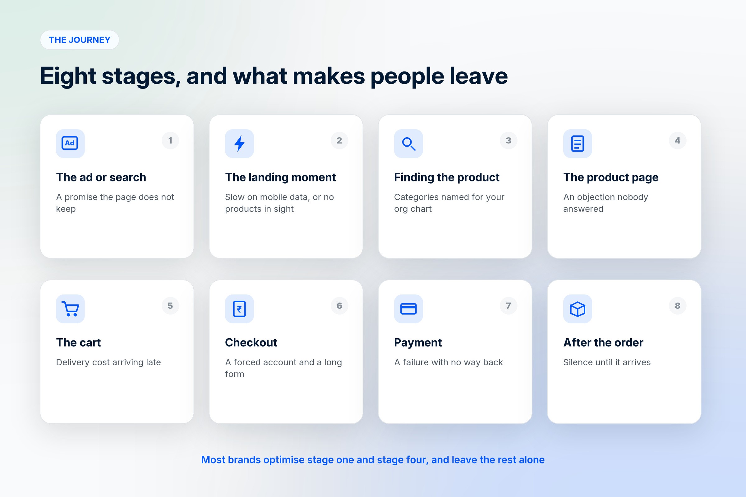
The ad or the search result. The product page in their head is formed here, before they arrive.
The landing moment. Three seconds to confirm they are in the right place.
Finding the right product, through a category, a filter or a search box.
The product page, where most of the deciding happens.
The cart, which is where surprises arrive.
Checkout, which is where friction arrives.
Payment, which is where technical failures arrive.
After the order, where the second purchase is won or lost.
Most brands optimise the first stage and the fifth, and leave the rest alone.
Stage 1: the ad or search result
The drop here is invisible, because it happens before anyone reaches your site. It shows up later as a high bounce rate that looks like a website problem.
What causes it. The ad promises something the page does not deliver. A discount in the creative that is not on the page. A product shown in a colour you do not stock. A price in the ad that excludes delivery.
What to do. Make the first screen of the landing page match the ad that sent people there, in image, price and wording. If the ad says "linen shirts from ₹1,290", the page should open with linen shirts and that price. The match matters more than the creative being clever.
Stage 2: the landing moment
The first three seconds answer one question: am I in the right place, and is this a real shop?
What causes the drop. A slow page, which on a phone on mobile data is the most common cause of all. A homepage that opens with a brand story rather than products. No signal that other people have bought here. A cookie banner or a popup covering the thing they came to see.
What to do. Measure load time on a mid-range phone on mobile data rather than on your laptop. Open with the product. Put the trust signals where the eye lands first: reviews, a returns promise, a delivery estimate. Delay the newsletter popup until someone has shown interest, or drop it entirely.
Stage 3: finding the right product
Buyers who cannot find the thing leave quietly, and this stage is almost never measured.
What causes the drop. Categories named after how your business is organised rather than how people shop. Filters that do not include the attribute people choose by, such as size, fit or material. A search box that fails on plurals, misspellings or the words customers actually use.
What to do. Name categories in customer language, which you can take from your own search logs and support messages. Add filters for the attribute people ask about most. Check your internal search for the twenty most common queries and fix the ones that return nothing. A search with no results should offer alternatives rather than a dead end.
Stage 4: the product page
This is where the real deciding happens, and where most hesitation is an unanswered question.
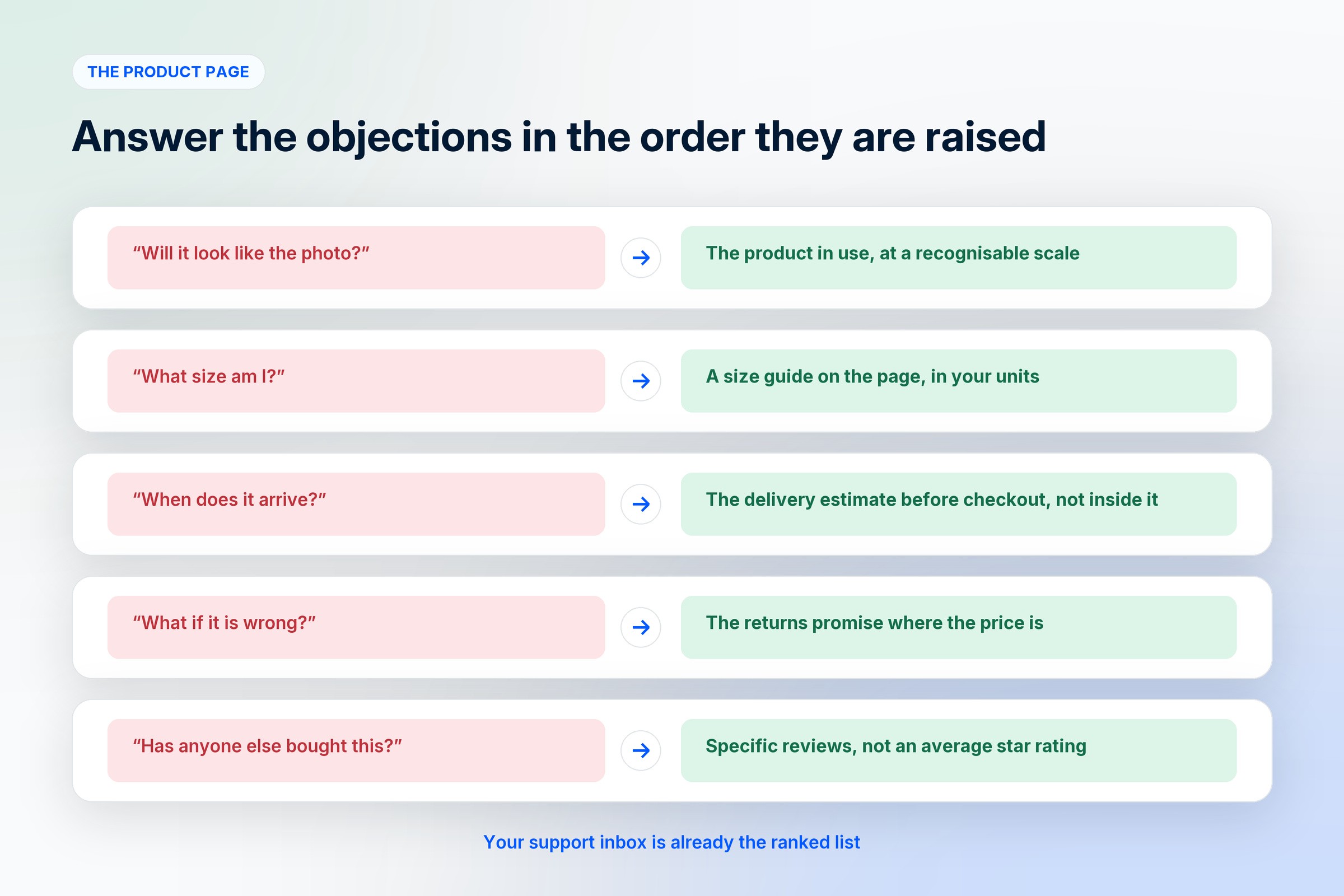
What causes the drop. Photographs that show the product but not the scale or the context. No size guide, or one that needs converting. Delivery time hidden until checkout. No reviews, or reviews that all read the same. A description written for the catalogue rather than for the doubt.
What to do. Rank the objections and answer them in order, in the customer's own words. Your support inbox is the ranked list. Show the product in use and at a recognisable scale. Put the delivery estimate and the returns policy on the page rather than three clicks away. If you have reviews, show the specific ones, since "fits as expected, slightly darker than the photo" sells better than five stars and no text.
Stage 5: the cart
The cart is where the price becomes real, and where a surprise undoes everything before it.

Cart abandonment is the most studied number in ecommerce. Baymard Institute, which has tracked it for over a decade, puts the documented average at about 70%, calculated across fifty separate studies. Some of that is normal browsing behaviour and will never convert. A meaningful part of it is avoidable.
What causes the drop. Delivery charges appearing for the first time at this step. Taxes added late. A minimum order value discovered at the end. A coupon field that makes people leave to hunt for a code they then cannot find.
What to do. Show the delivered price as early as you can, on the product page if possible. If delivery is free above a threshold, say how far away they are from it. Keep the coupon field small and unobtrusive, since a prominent empty box is an invitation to go looking elsewhere.
Stage 6: checkout
Baymard's checkout research, built on fourteen years of usability testing, reports that the design and flow of the checkout is frequently the sole cause of an abandoned purchase. The product and the price were already accepted by this point.
What causes the drop. A forced account before purchase. A form asking for more than is needed. Address entry that fights with how people actually write addresses. No visible progress, so the end is unknown. A missing payment method, which in many markets means the one people actually use.
What to do. Offer guest checkout and ask for the account afterwards, when you have something to offer in return. Cut every field that does not affect fulfilment. Use address lookup. Show progress honestly. Offer the payment methods your market uses rather than the ones that are cheapest for you.
Stage 7: payment
The quietest drop, because it looks like success in your analytics until you compare orders to payment attempts.
What causes the drop. A failed transaction with no clear retry. A redirect that loses the cart. A silent wait after paying, which makes people refresh and sometimes pay twice. No confirmation anyone trusts.
What to do. Test the failure path, not only the happy one. A failed payment should return to a cart that is still full, with a clear retry and an alternative method. Confirm immediately on screen and again on the channel the customer uses, which for many buyers is WhatsApp rather than email.
Stage 8: after the order
The journey does not end at payment, and this is the stage with the best return on effort, because the person has already bought.
What causes the drop. Silence between order and delivery. A tracking link that does not work. No prompt to buy again at the moment it would make sense.
What to do. Send real updates at dispatch and delivery. Ask for a review a few days after arrival rather than the same evening. Time the next message to the product's own cycle, which for a consumable is roughly when it runs out.
How to find your own drop-off
Stop guessing and measure the gaps between stages. The shape is the same everywhere, but the worst gap differs by store.
Count sessions, product views, add to cart, checkout starts and paid orders. The percentage between each pair is your funnel, and the biggest fall is where the money is.
Watch the pages where people leave, on mobile specifically, since that is where most traffic and most friction live.
Read your support messages for the week. Every repeated question is a drop-off with a name attached.
Try to buy from your own store on a phone, on mobile data, as a new customer with a card you have not saved. Most teams find at least one real problem in the first attempt.
Fix in this order
Speed on mobile, because it multiplies every other change.
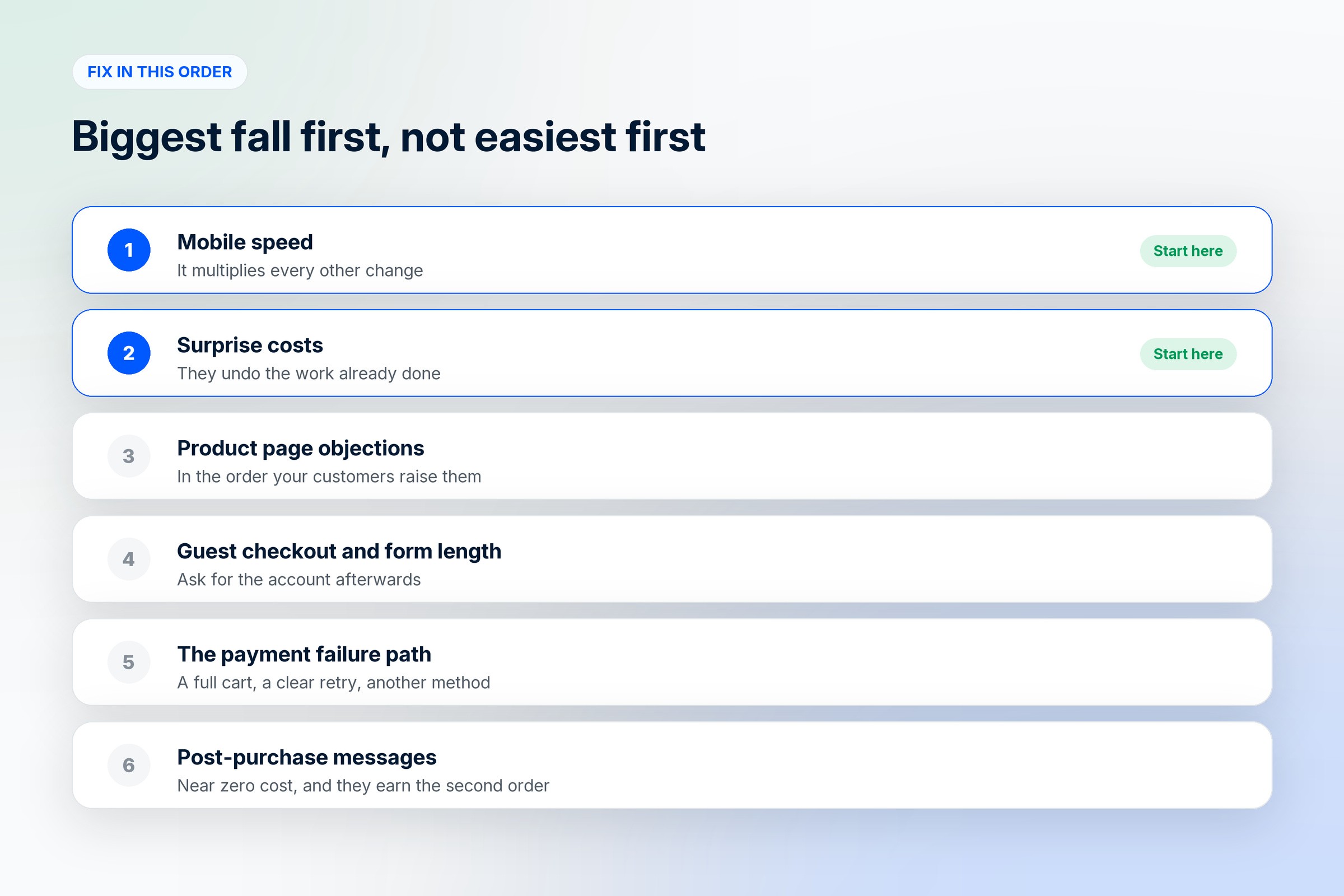
The surprise costs, because they undo the work already done.
The product page objections, in the order your customers raise them.
Guest checkout and the form length.
The payment failure path.
The post-purchase messages, which cost almost nothing and earn the second order.
Frequently asked questions
What is the user journey on a D2C website?
The path from the first ad or search result through landing, product discovery, the product page, cart, checkout and payment, and then on to delivery and the next purchase. Each step between those stages has a measurable drop, and the gaps are where conversion is won or lost.
Where do most buyers drop off on an ecommerce site?
The cart and the checkout account for the most visible losses, with documented cart abandonment averaging around 70% according to Baymard Institute's analysis of fifty studies. Quieter losses happen earlier, when people cannot find the right product, and later, when a payment fails without a clear retry.
Why do people abandon their carts?
Usually because something changed at the last moment. Delivery charges or taxes that appear late, a minimum order value found at the end, or a checkout that asks for an account and a long form. Some abandonment is ordinary browsing and will never convert, but surprises are avoidable.
How can I increase purchase conversion on my D2C website?
Measure the drop between each stage, then fix the biggest one first. In most stores that means mobile speed, showing the delivered price early, answering product page objections in the customer's own words, offering guest checkout, and making a failed payment recoverable.
Who should own conversion in a small brand?
Whoever reads the customer messages, because that is where the objections and the confusion are already written down. It does not need a specialist before it needs someone who has tried to buy from the store on their own phone.
When should I start working on conversion rather than traffic?
Once you have enough visitors to see where they stop. Buying more traffic for a page that loses people simply discovers the same problem faster and at a higher price.
Where does post-purchase fit into conversion?
At the end and at the beginning. The messages after an order decide whether the next purchase happens without an ad, which is the cheapest conversion available to a D2C brand.
Where to go from here
The objections you answer on the product page come from knowing who is buying, which is in how to create a user persona. If the traffic side is what you are working on, there is how to set up Meta ads for D2C brands. For the platform underneath all of it, see the D2C ecommerce builder guide. For traffic, order value and repeat orders as well as conversion, see how to increase website sales.
1D2C gives you the pieces this needs in one place: a storefront you can change without a developer, delivery estimates and tax shown where buyers expect them, WhatsApp for order updates and recovery messages, and order data connected to your ad account so you can see which stage actually improved. Plans and regional pricing are on the pricing page.
Cart abandonment and checkout findings above are from Baymard Institute, checked in October 2026. Everything else is general practice rather than a platform claim.


